UX & UI
Galp 40 Years
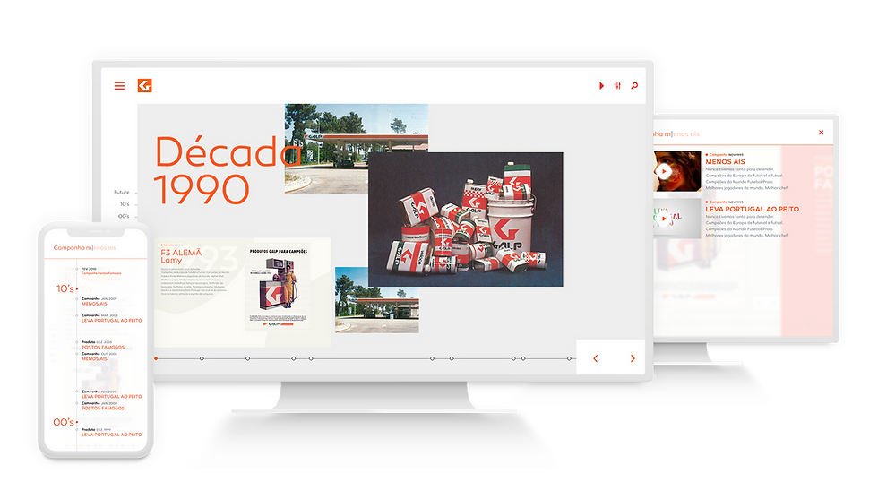
A digital archive from the last 40 years of Galp. One of the biggest and most important brands in Portugal.

Overview
Galp's 40 Years is a Marketing and Advertising Archive with a remarkable collection showcasing the evolution of marketing and advertising strategies employed by Galp, a leading energy company, over the past four decades. This extensive archive offers a fascinating glimpse into how Galp's branding, messaging, and visual identity have transformed over time, reflecting not only changes within the company but also broader shifts in consumer culture and market trends. From the bold and colorful campaigns of the 1970s to the sleek and modern designs of today, this archive provides invaluable insights into the company's journey and its efforts to connect with customers in a rapidly changing world.
By delving into this archive, users can witness the creative evolution of Galp's marketing materials, from print ads and TV commercials to digital campaigns and social media content. Each artifact tells a story of innovation, adaptation, and strategic communication, highlighting the company's commitment to staying relevant and engaging in an increasingly competitive market. Whether exploring iconic slogans, memorable imagery, or pioneering advertising techniques, Galp's 40 Years Marketing and Advertising Web Archive offers a rich and inspiring resource for marketers, historians, and anyone interested in the intersection of business and culture.
Role
Responsible for the UX & UI, in order to design Galp 40 years website, I assumed the following roles:
-
User Experience;
-
User Interface;
-
Visual Designer;
-
Work closely with the Front End and Back End developers;
Deliverables
-
Low-fidelity wireframes;
-
High-fidelity mockups and prototypes;
-
Design System and UI Kit;
-
Usability Tests
2010
2000
1990
1990
1991
1992
1993
1994
1995
1996
1997
1998
1999
1970
1980
Branding the Experience
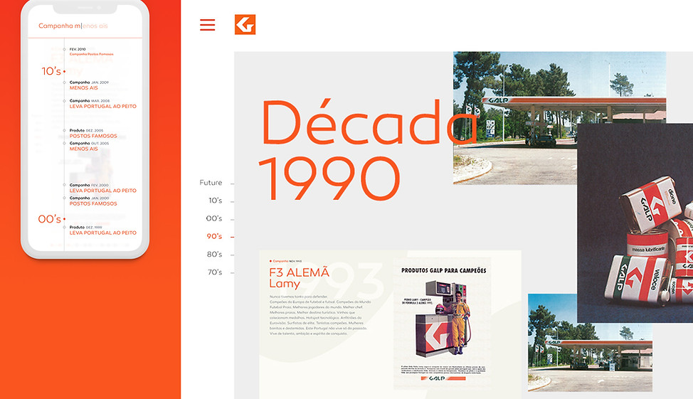
High-fidelity prototype testing brought users to the closest experience yet, and it revealed some issues. While users were able to complete the tasks, they found that it had a lot of information per screen, and some small details such as status and iconography were not clear. Therefore, the content was then reduced, and design details were adjusted to make the experience more clear before creating the design system.


— Other Projects

UX & UI
A seamless and intuitive user experience, meticulously designed to simplify the process of purchasing insurance products.

UX & UI
A personalised TV experience, with faster and more direct access to users consuming habits, facilitating content discovery, rental and subscriptions.